overfishing
The case study explores the process of designing an interactive exhibit to educate users about overfishing. The exhibit aimed to take the user on an emotional journey and encourage them to take active action with the help of playful interactions.
__________
The Design Process
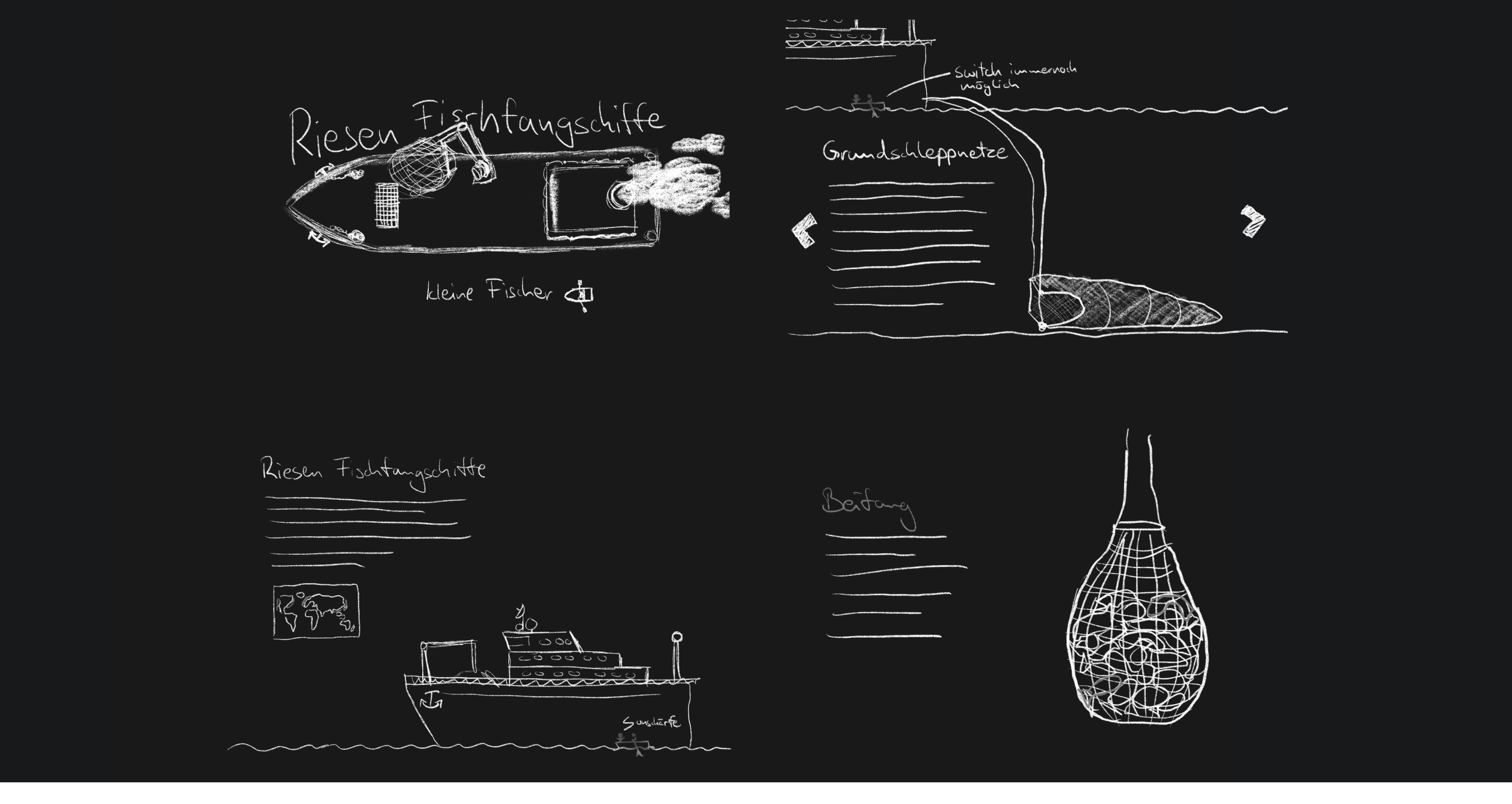
The first step in the design process was to do an extensive research to cover all the relevant topics. After gathering rough information, the team selected specific main topic areas, including the different types of nets used by the fishing industry, bycatch, the ecosystem, and possible solutions. The goal was to educate users about the complexity and relevance of overfishing.
The next step was to define the target group and their requirements. The team decided to target young and adult users to convey complex issues in an understandable manner. The exhibit was designed to be clear and easy to use, so that even visitors without good technical skills can understand all interactions.
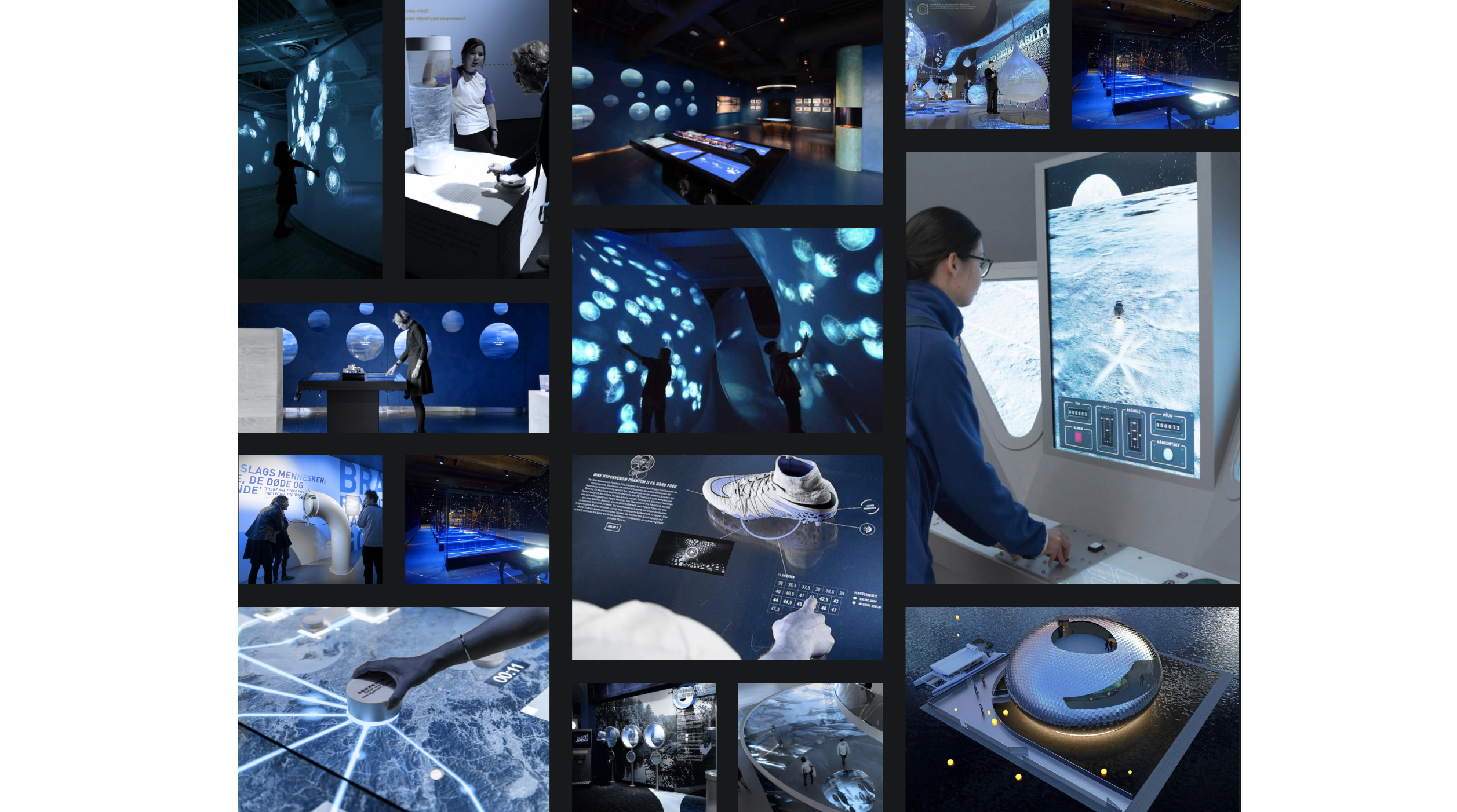
To gather inspiration for the spatial and conceptual design, we carried out benchmarking. We collected many ideas about interaction elements, spatial design, and staging possibilities. The idea of using a touchscreen in conjunction with a water tank and a crank to entice the user to interact more with the exhibit in a playful way was developed.
Next we gathered inspiration on various illustration styles, fonts, colors, and layouts for the visual design. A matrix was created to classify all inspirations into four categories: 2D vs 3D and playful illustrated vs technically modern.
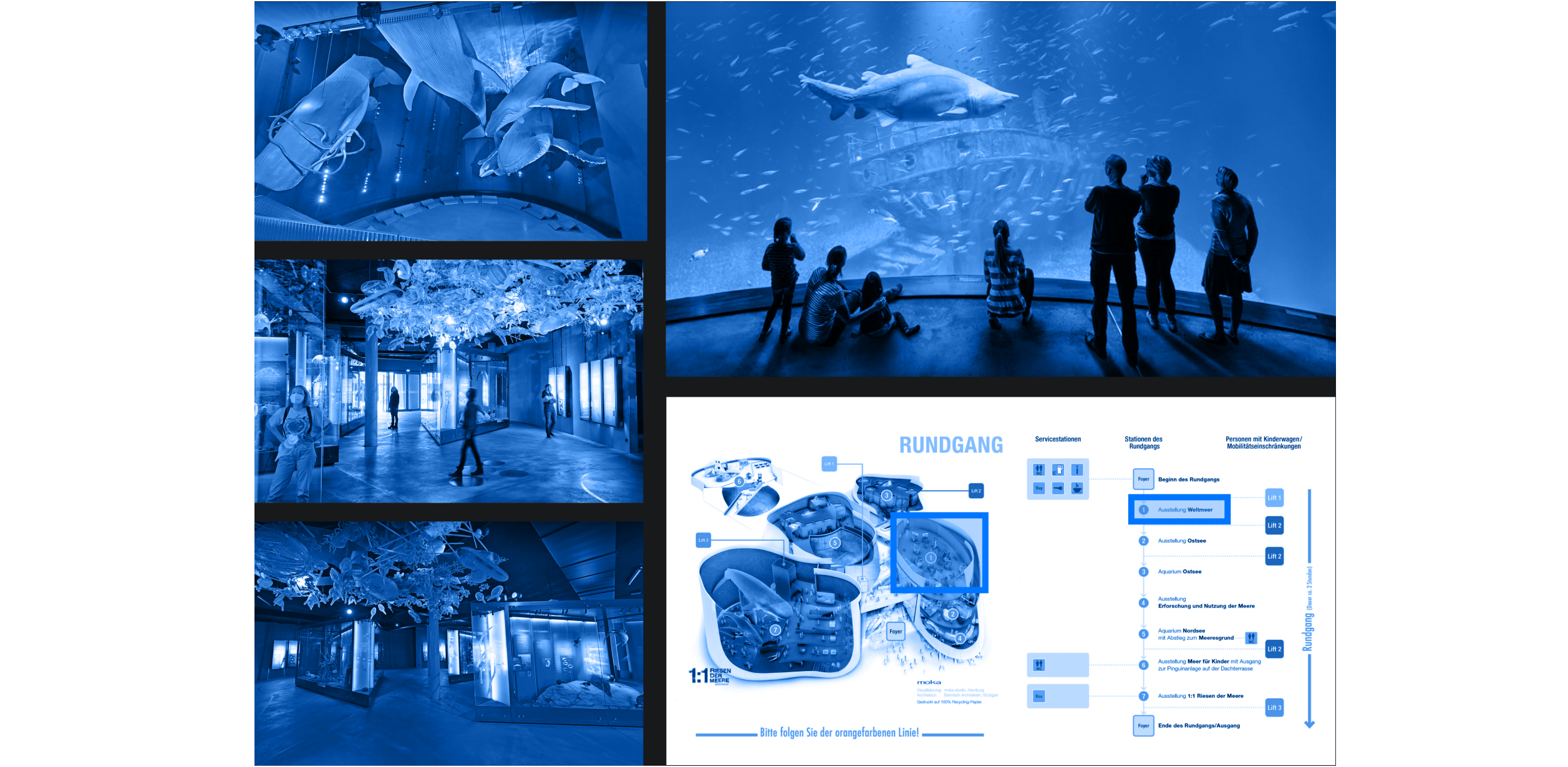
The OZEANEUM maritime museum in Stralsund inspired the team to be part of the marine exhibition with their exhibit. The concept was to position the product in the middle of the other aquariums, screens, and objects.
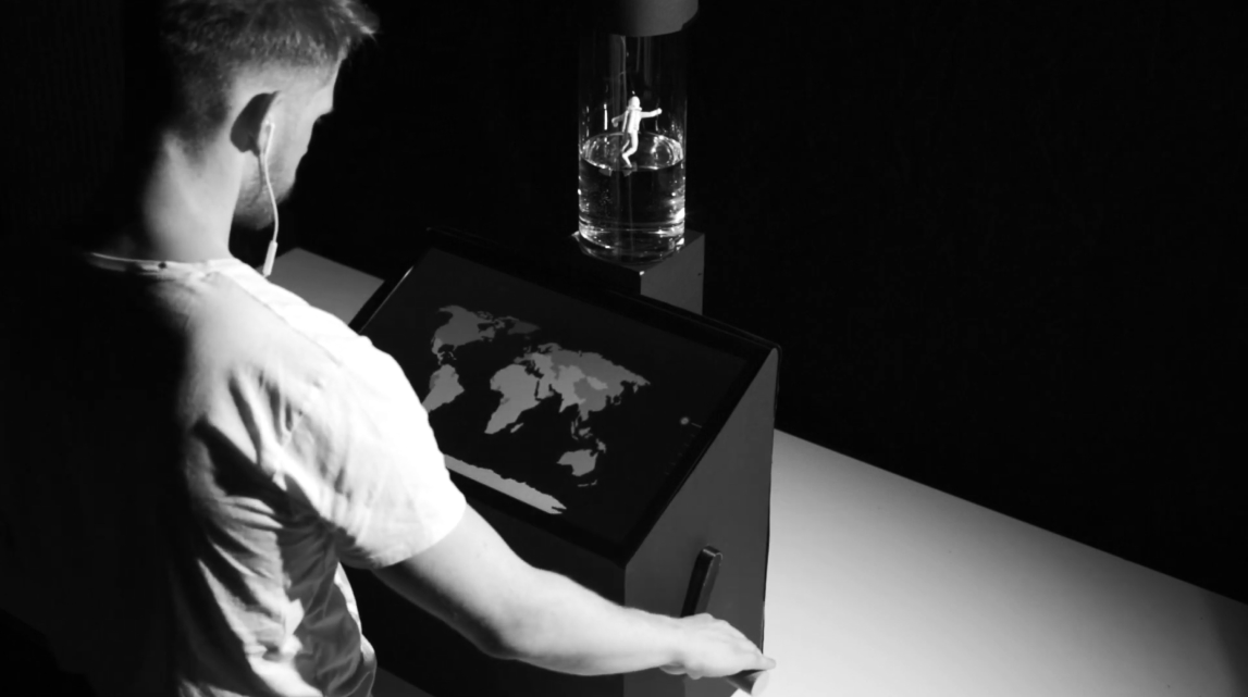
To convey the feeling of being underwater, the team created the atmosphere of an underwater world with the help of light and sound effects. The user gets their own headphones with matching underwater sounds to create the most personalized experience possible.
Since the subject area offered a large amount of data and information, the team was free to decide on the narrative structure. They settled on a mixture of both linear and explorative components, so the navigation is linear, but more information can be accessed via the touch display if the user is interested.

The team sketched the first ideas of the later illustrations and thought about where to arrange interaction elements and texts. The design ideas became more and more concrete and detailed wireframes were created to determine the arrangement of the individual elements and to make the first visual ideas become real.
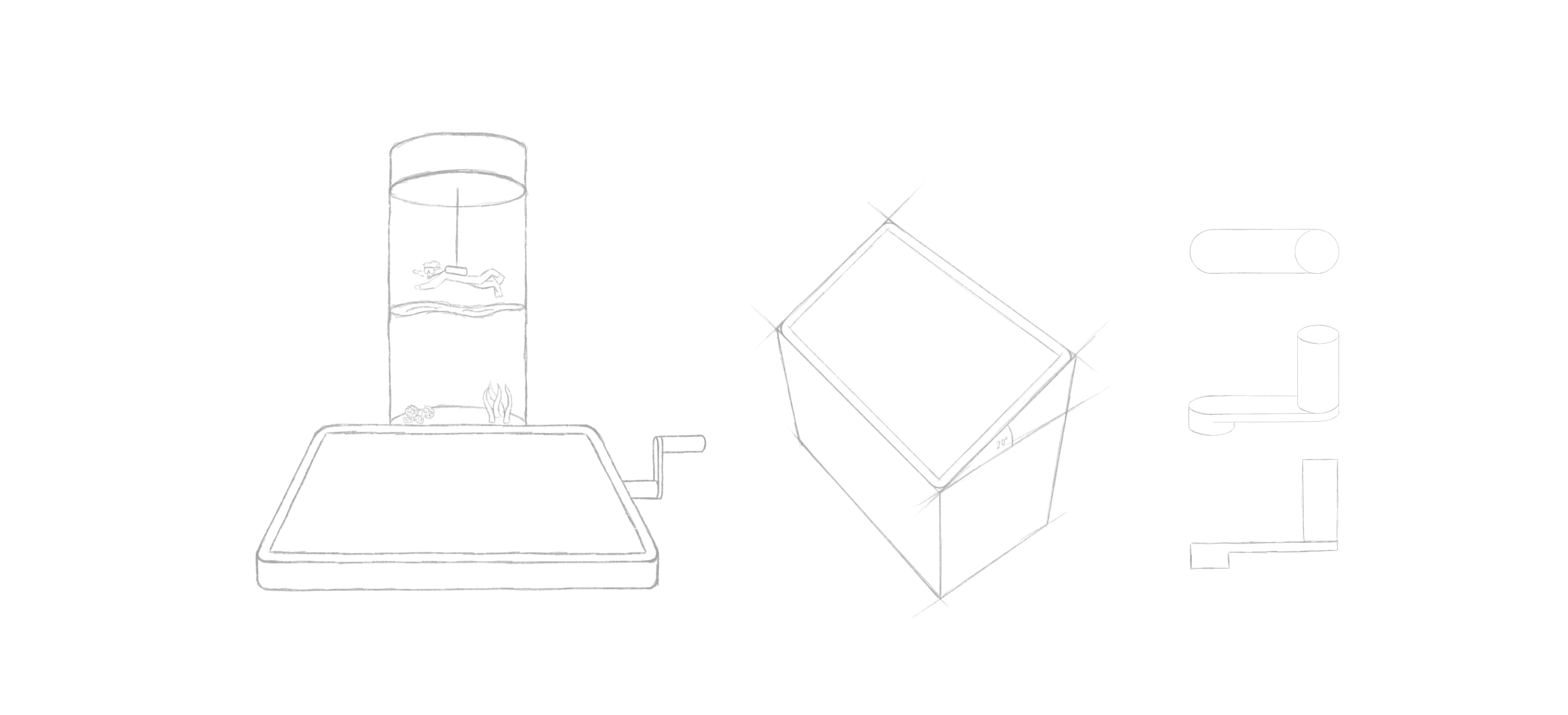
The exhibit consists of several components that simplify navigation, but also offer an immersive experience that should encourage users to try it out. The cylindrical water tank is an eye-catcher and is half filled with water in which a diver can be lowered and raised by a motor. The geographic height is symbolized by the water level and a scale is printed on the outside of the water tank.
Centrally below is a 21“ inch touch display on which the contents are displayed. On the right side of the display is a crank handle, which can be used to navigate through the screens and to move the diver. On the other side are headphones to make the experience even more immersive.

__________
Design Elements
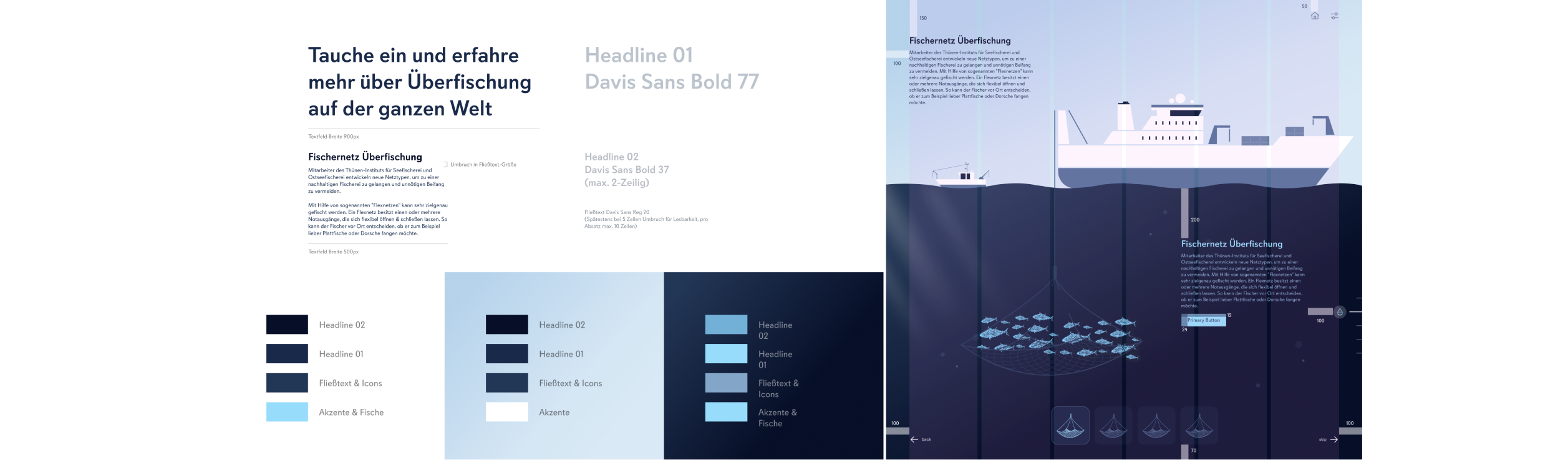
The design team tested several font suggestions on different backgrounds in various weights and formatting to determine the most suitable one for the project. They eventually decided on the Davis Sans font, a sans-serif geometric typeface that looks friendly and inviting with its open punches and large round i-dots.
The geometric illustrations, created with Cinema 4D, match the font style and create a harmonious overall image. A grid system was created to ensure uniform placement of all elements in the user interface. Six vertical columns provide enough flexibility for the arrangement of the elements within the grid but still ensure a uniform appearance.
__________
Icons and illustrations
The team used some icons from the IBM Icon Library, which have uniform line width, proportions, and geometric shapes, fitting well with the geometric font & illustration style. We also created their own icons for the scale, which fit perfectly into the IBM Library.
The scale on the right side of the layout represents the user’s current position within the interface and creates a visual connection to the diver in the water column and the crank that guides the user through the interface.
The illustration style is flat and geometric, matching the flat style of the Cinema 4D sea creatures, which also consist of many geometric circles. The reduced, abstracted design of the illustrations is used to bring the functions across clearly.
__________
Prototype
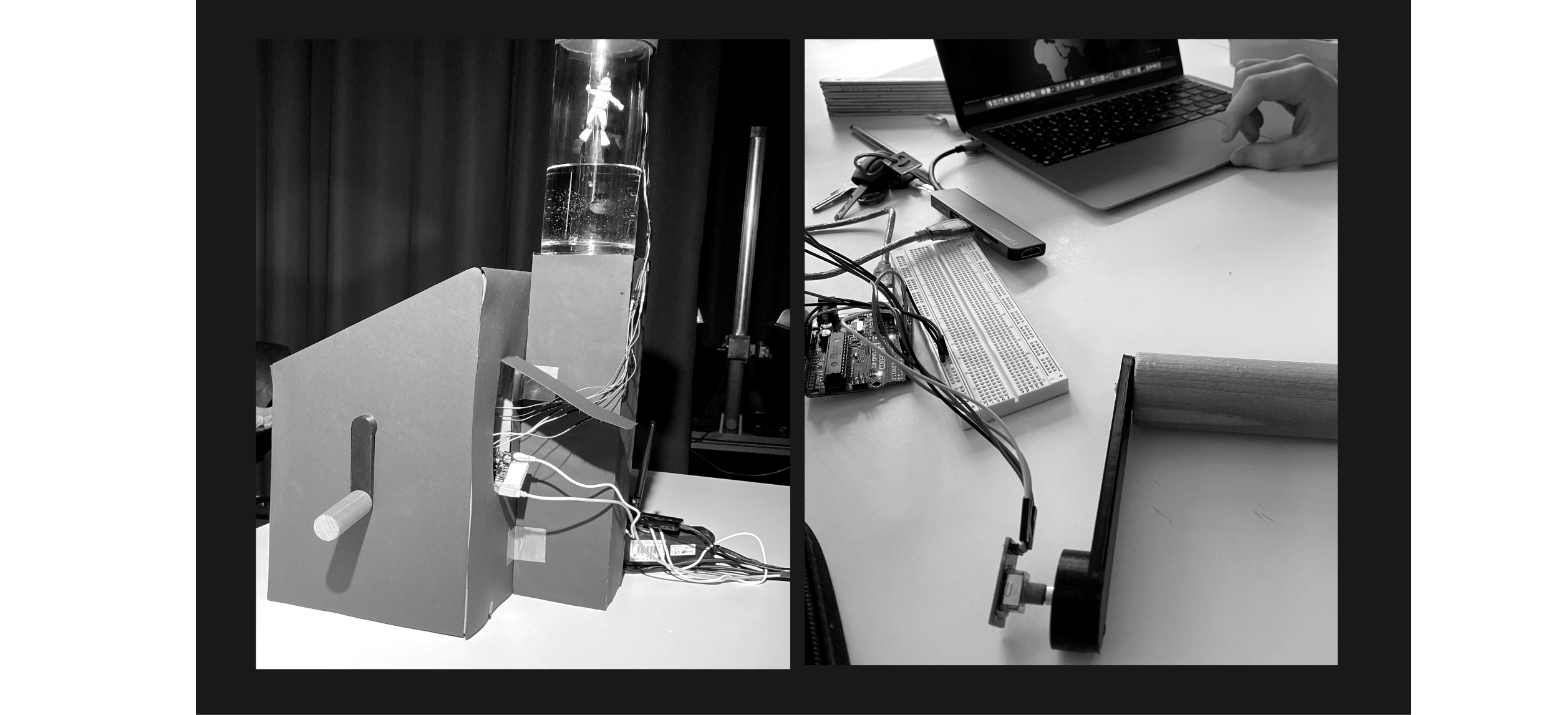
The team created physical prototypes to add an interactive dimension to the project. The main element of interaction with the physical prototype was the crank, which used a rotary encoder in connection with an Arduino microcontroller. The rotary encoder reads the revolutions and forwards them to the Arduino. Another essential component of the prototype was the stepper motor, coded to respond to the revolutions read from the Rotary Encoder as well. On the extension of the stepper motor, the team put a plastic spool on which they wound a thread. If they moved geographically closer to the ground in the story, the motor would let the thread down synchronously.
Thus, the diver, who hangs on the thread, permanently indicated the geographical height position and the current position in the story.
_________________________________________________________________________________________________________________________________
Conclusion & Learnings
The interactive exhibit on overfishing was designed to educate users about the complexity and relevance of overfishing while taking them on an emotional journey and encouraging them to take active action with the help of playful interactions. The exhibit was designed with the target group in mind
Accessibility The team included a settings icon that allows users to change the volume and contrast settings, making the interface more accessible for people with disabilities.
________________________________________________________________________________________________________________________________________
Consistency We created components for elements such as buttons, arrows, and icons, which allowed each team member to access them quickly and easily. This ensured consistency in the design throughout the interface.
________________________________________________________________________________________________________________________________________
Iteration and prototyping Using visual prototyping tools like ProtoPie helptd us to iterate on their design and create a functional prototype that integrated with Arduino. This allowed us to test and refine their design before finalizing it.

Creativity and innovation The team used a stepper motor and plastic spool to create a physical prototype that synchronized with the interface and allowed the user to interact with the story in a unique and engaging way.
________________________________________________________________________________________________________________________________________
Overall, the project highlights the importance of collaboration, user-centered design, accessibility, consistency, iteration and prototyping, and creativity and innovation in creating an effective and engaging user interface.